Newark City Parks
*
Newark City Parks *
Brand Identity
As part of the Design Consortium, our team developed an updated brand identity for the Newark City Parks Foundation (NCPF), an organization that manages and activates five downtown Newark parks: Lincoln Park, Military Park, Mulberry Commons, Riverfront Park, and Harriet Tubman Square. The project aimed to strengthen NCPF’s visual presence across print, digital, and environmental applications through a unified yet adaptable
brand system.
In Spring 2025, Graphic Design students from the Department of Arts, Culture, and Media collaborated with NCPF to reimagine its visual language, drawing inspiration from the city’s parks as shared spaces of gathering, movement, and connection.
The resulting citywide campaign, now visible across banners, calendars, and digital platforms, demonstrates how participatory design education can enhance public life through research-driven storytelling and collaborative practice.
Identity Lockup
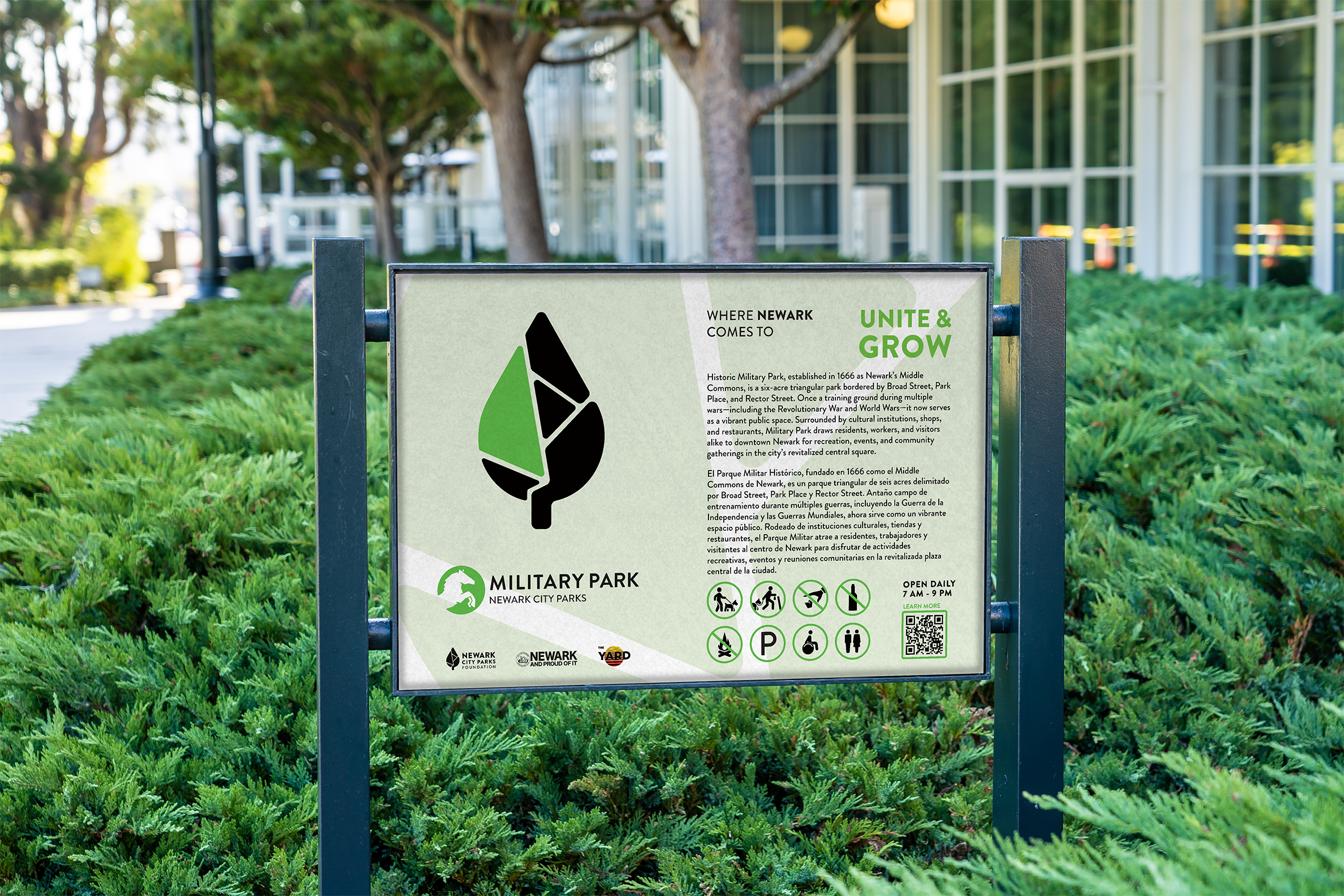
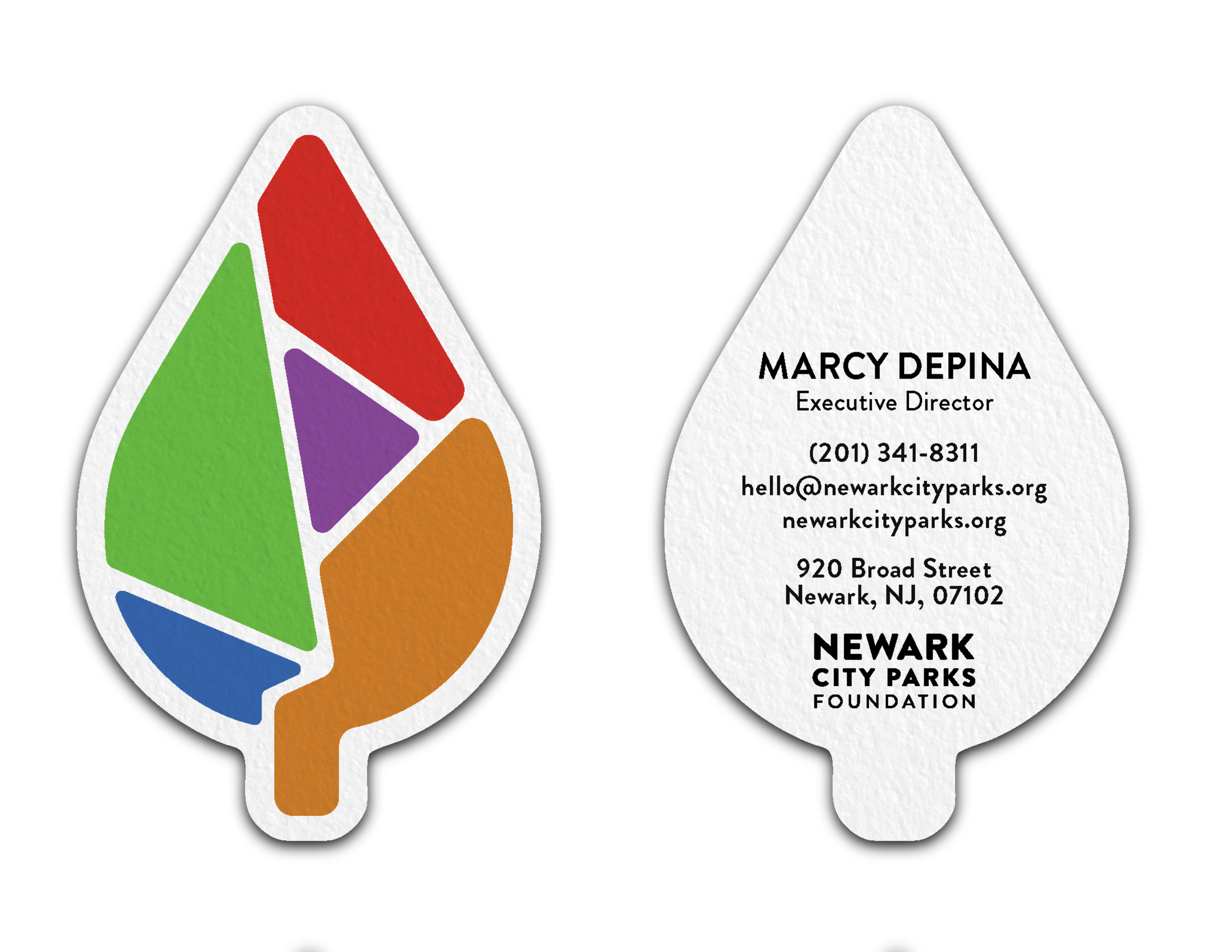
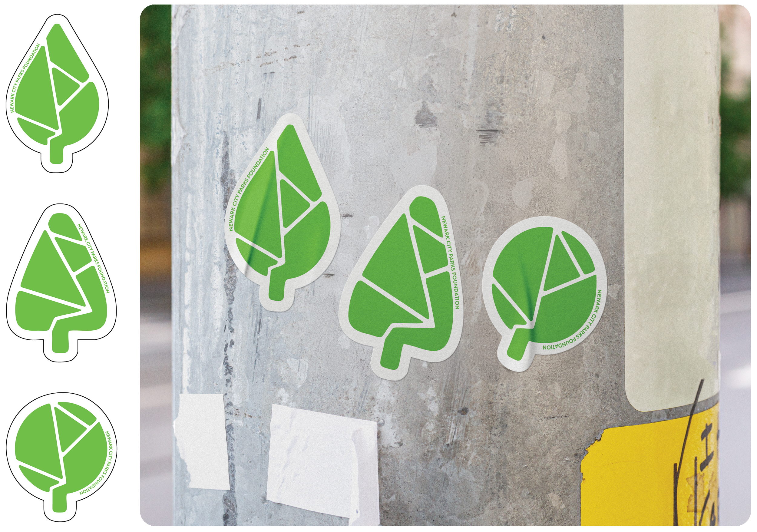
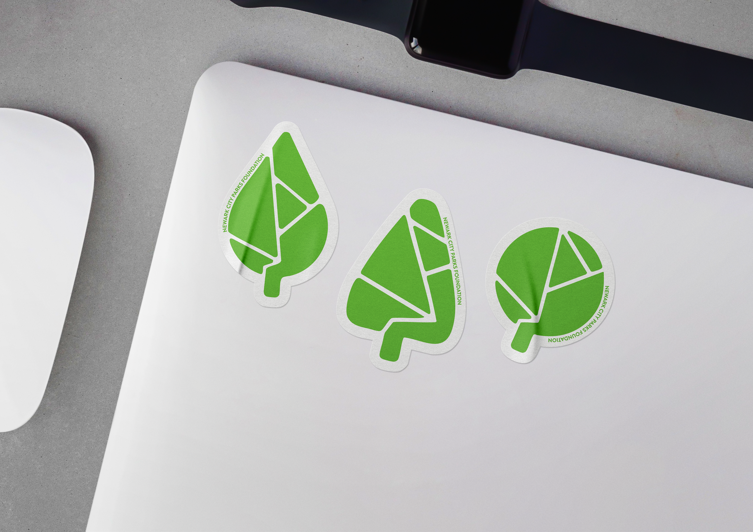
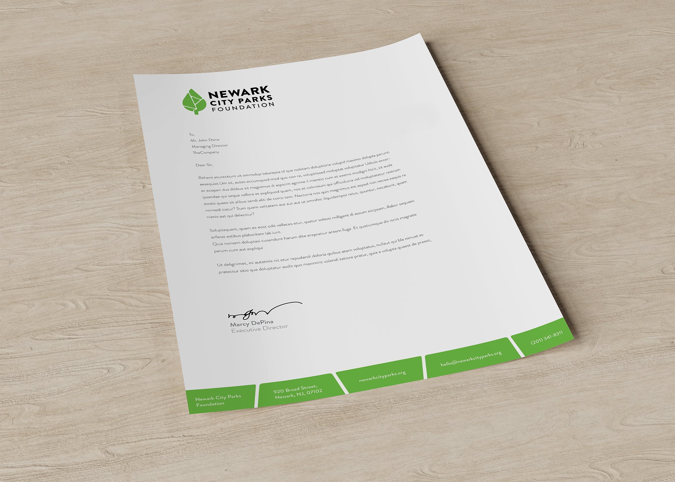
The completed identity system combines the refined NCPF tree mark, now integrated with the cartographic forms of Newark’s five parks, with the bold and approachable Brandon Grotesque typeface. This design reflects the harmony between nature and infrastructure, showing the foundation’s mission to make Newark’s parks more accessible, engaging, and community-driven.
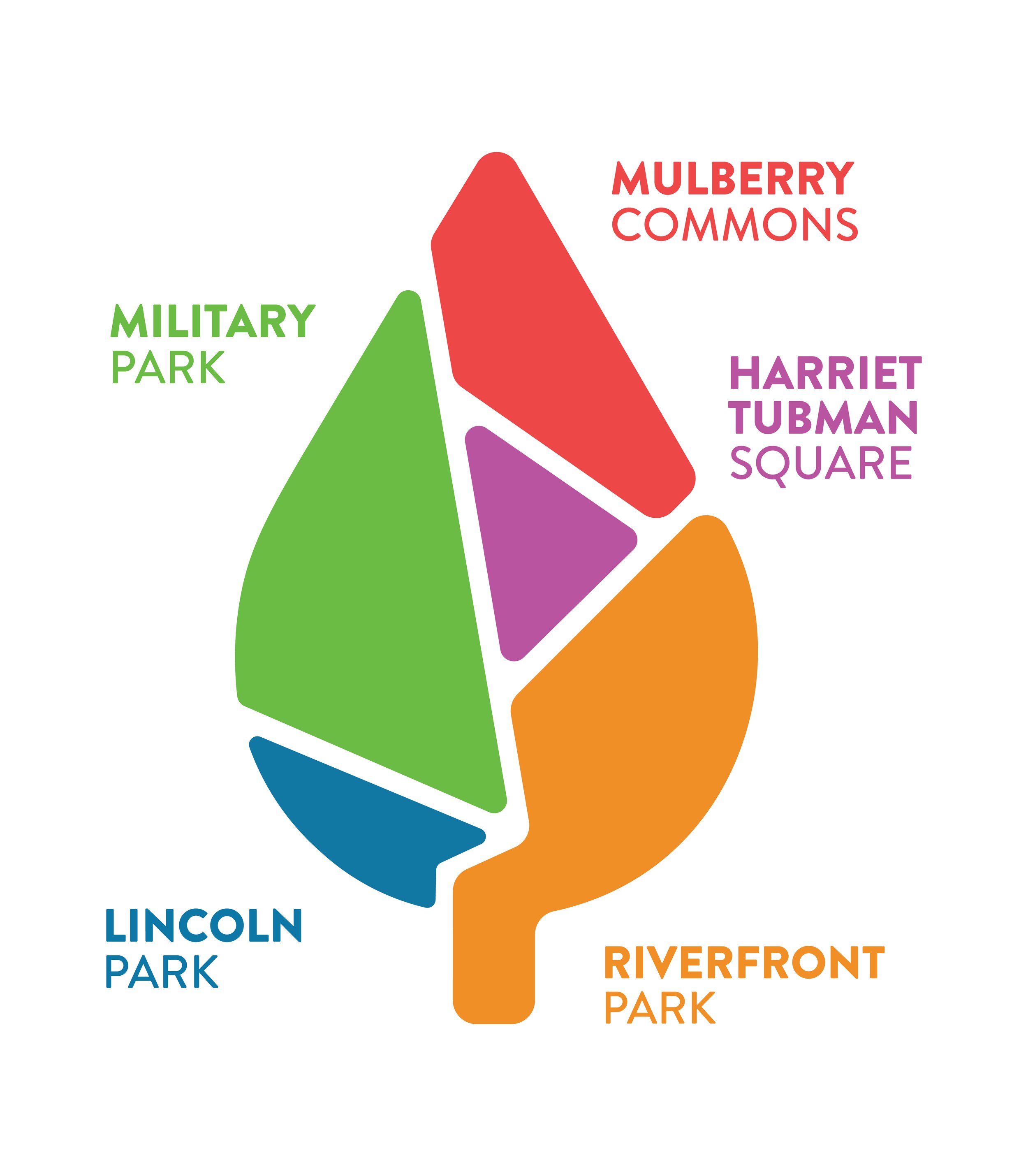
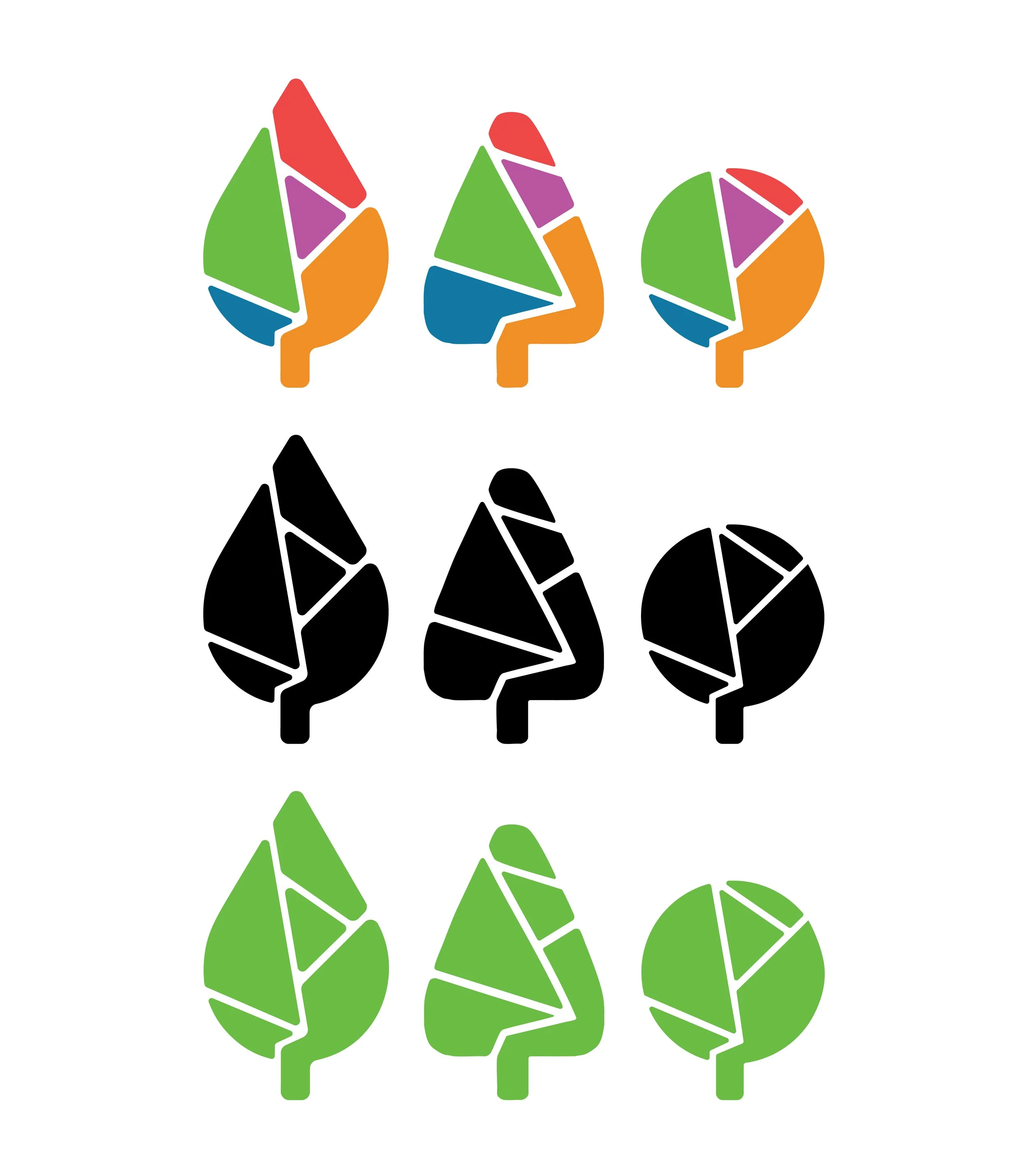
From these foundational elements, we expanded the NCPF brand, creating a more cohesive and approachable identity. We refined the tree silhouettes to feel more organic and inviting while maintaining their recognizable forms. The parallel lines were transformed into city street inspired lines to integrate more seamlessly with the cartographic-inspired shapes we developed for the parks, reinforcing a sense of infrastructure.
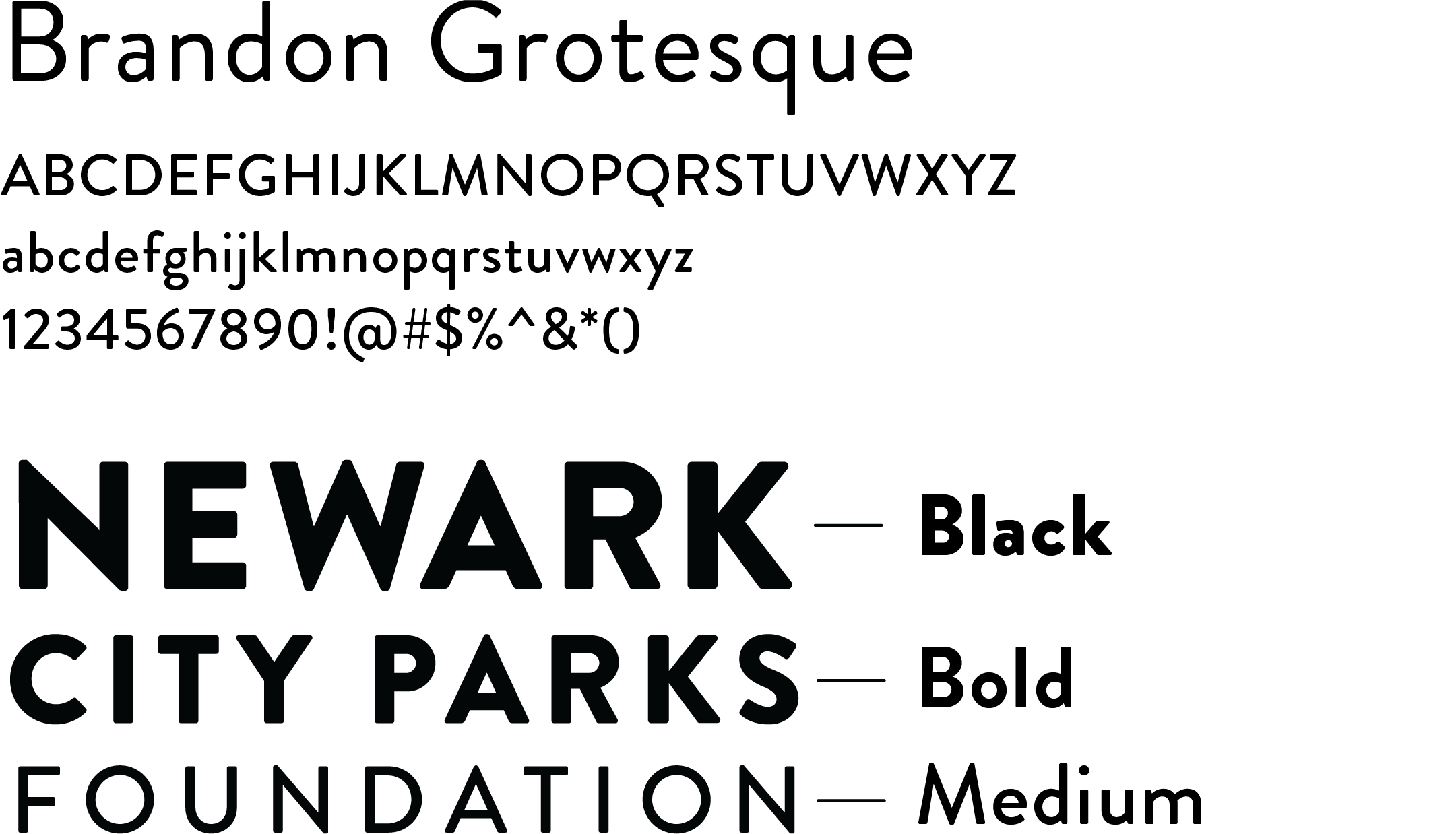
Typography
Selecting the right typeface was essential to reinforcing the visual and conceptual themes of the project. We chose Brandon Grotesque, a typeface that balances a dynamic industrial aesthetic with a bold yet approachable appearance. Its strong, sharp lines echo the structured elements of cartography and Newark’s urban landscape, while its rounded edges maintain a sense of playfulness and accessibility. This combination allows the brand to feel both modern and rooted in the city’s identity.
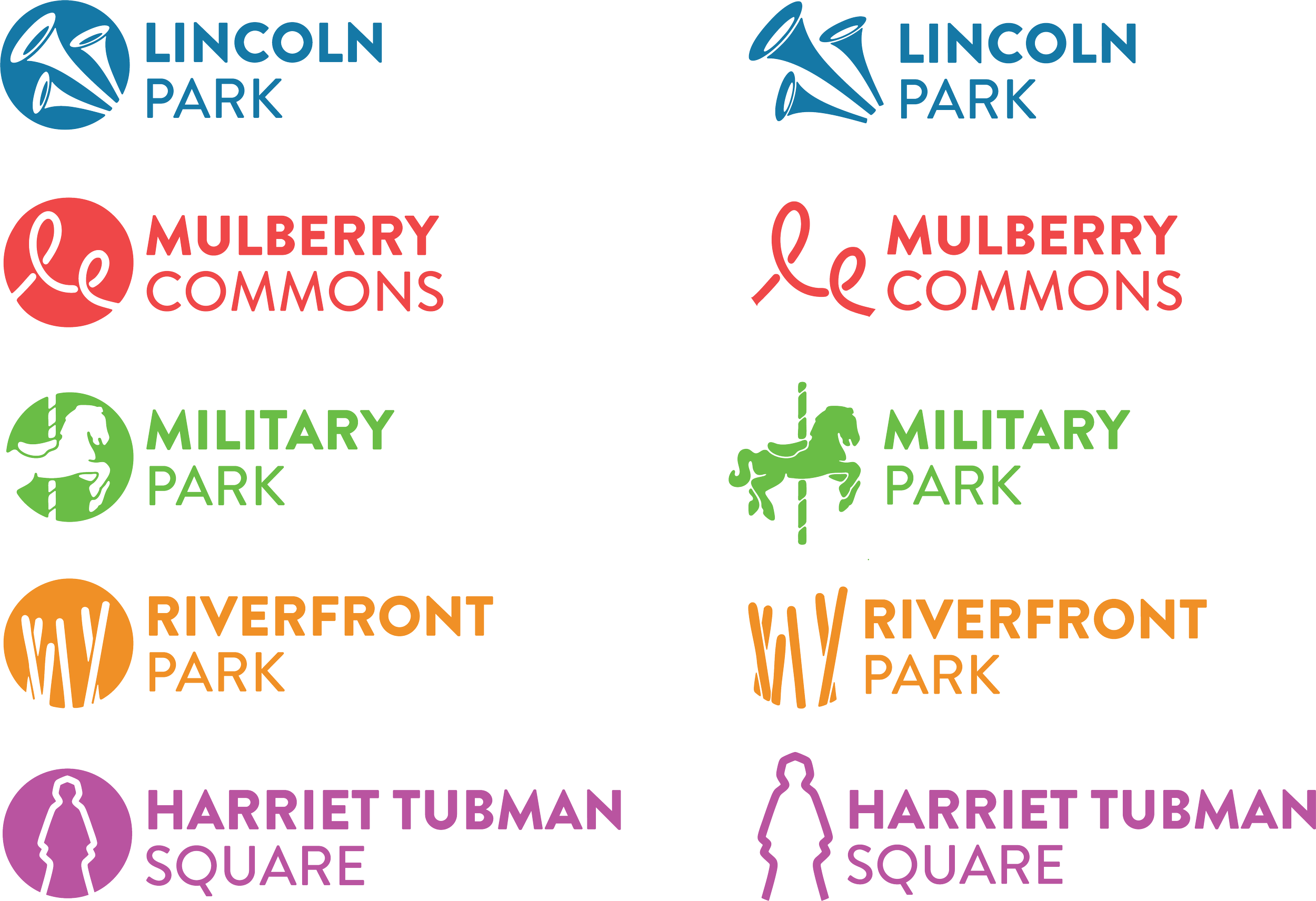
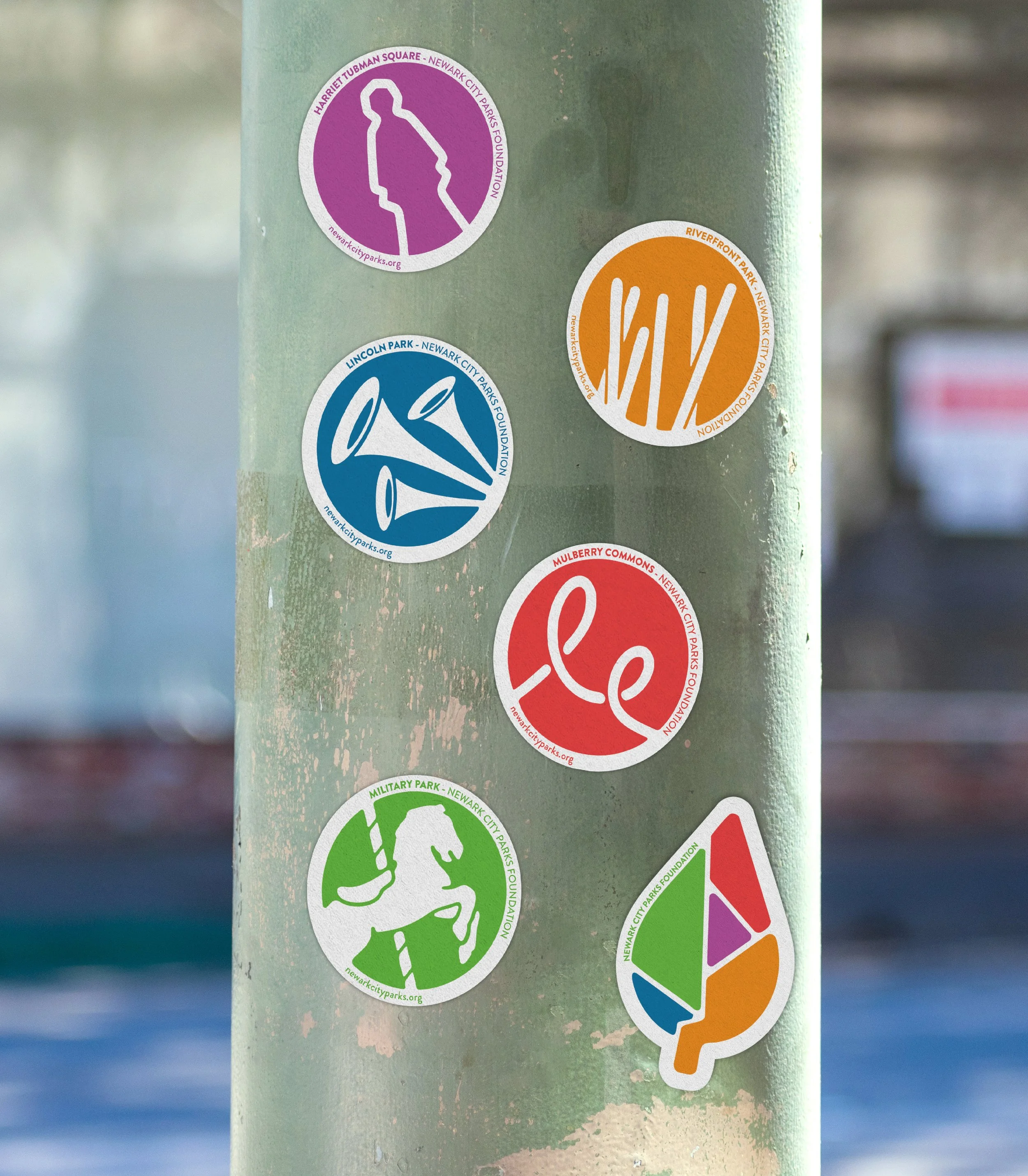
Sub-Identities
To further establish a unique identity for each of Newark’s five major parks, we designed individual sub-identities using polygonal forms within a circular shape, mirroring the structure of our dynamic tree system. Each park’s identity highlights an iconic element that reflects it’s individual character and significance.
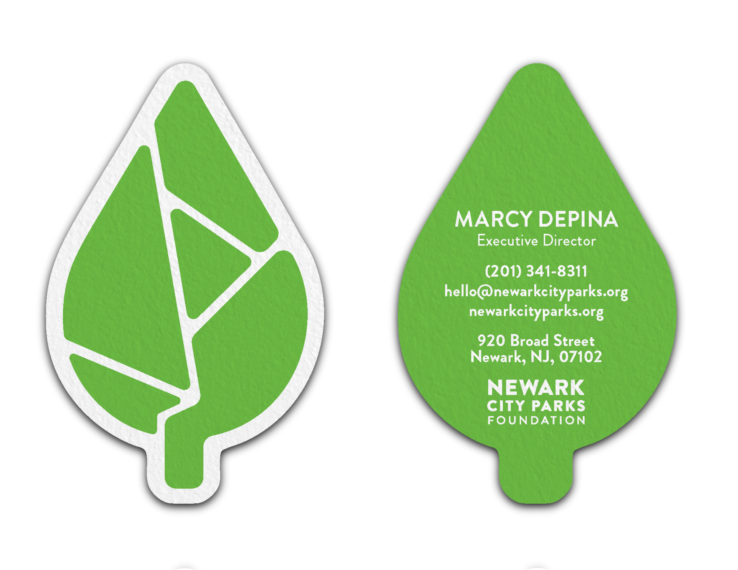
Mockups